
XenonRadon - 6-8-2019 at 14:49
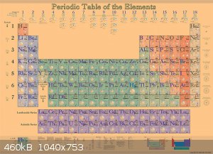
Looking for your opinions. As a STEM initiative I'm designing a version of the periodic table that helps visualize and explain various properties of
the elements. It makes apparent the organization of elements in the table, and allows for easy comparisons between the elements. The design is not
final – I am gathering feedback. There is more info on the project at thinkacthuman.com.
I'll appreciate any thoughts or suggestions.
Thanks - Dan
ZetekitoxinAB - 6-8-2019 at 15:24
To me it seems overly complicated and blurry... Why do you want to design a new periodic table? Also I prefer numbers comparing atomic radius,
electronegativity etc. to graphics.
Designing a periodic table, a STEM initiative
XenonRadon - 7-8-2019 at 06:17
The chart is created using vector graphics (all created in Adobe Illustrator), so it's high-resolution and not blurry at all. (The jpeg that's posted
here is low-resolution - check the thinkacthuman web site for more information.) All the numbers you're referring to are included in the chart. The illustrations readily depict the
properties and allow for clear visual comparisons.
Felis Corax - 7-8-2019 at 06:42
I wouldn't call that a new periodic table. It's more the normal one but with graphical rather than numeric representations of some properties. Which
could be handy for getting an intuative idea of those properties or making quick qualitative comparisons, but it's also rather busy and cramped.
Probably best deployed as a huge poster where every cell can be large and readable.
Periodic table
XenonRadon - 7-8-2019 at 19:22
Thanks - yes, the size is 42" x 58", it's a large wall chart, and each element is readable at it's full-size.
Felis Corax - 7-8-2019 at 21:30
In that case change the background to a pale lavender and fix some of the cells where the element name overlaps the symbol and you've got a winner.
Changing the aspect ratio of the cells may help with that last part, though it would also change the dimensions of the table.
diddi - 7-8-2019 at 23:09
is this going to be in hard form or digital?
What is the target audience?
[Edited on 8-8-2019 by diddi]
XenonRadon - 8-8-2019 at 08:51
Thanks Felis. I have a number variations in typefaces and color, this is more of a template to get feedback on the way the information being
portrayed. I'll post those variations.
diddi - this is designed (at this point) for print. I'm working with college faculty advisors, as well as high school educators. Looking for
additional feedback. Also expecting this will find its way into various labs.
andy1988 - 8-8-2019 at 13:34
I suppose you could consider sticking a qr code at the bottom right, to link to a digital interactive version or other relevant web site.
I am skeptical of the utility of a poster for such fine detailed references however. They are not visible from classroom desks at a distance.
Within high school education & early college my experience was multiple 8"x11" periodic table printouts were handed out to each student with just
information relevant to the work that week, like electronegativity, oxidation numbers, or whatever. I think that practice works fine as reference
material for assignments and tests. With perhaps a recommendation of an web-based interactive version.
[Edited on 9-8-2019 by andy1988]
Herr Haber - 9-8-2019 at 05:11
The idea is not bad.
It's only a question of how or when is another view useful.
The periodic table is pretty much like a map: you can add layers and layers of information but after a while it becomes unreadable so you make a
second map with different information.
I agree with the others on one point though: it's not useful if it's not (very) big.
andy1988 - 9-8-2019 at 12:03
Personally I'm interested in well designed lab safety posters. Too many "safety" posters are vague and essentially devoid of useful instructions.
Posters targeting not just lab users but visitors as well. Some I see are cartoony clip art... not professional (though 'The Simpsons' posters are
fine!). A poster describing best procedures on use of a fume hood is one good example. Though one thing I'd add is to leave the fume hood on if your lab partner left it on, they may be getting rid of
residual toxic vapor coming off of equipment or whatever, I'd made that mistake before at work, it was a 24 hour standard procedure to get rid of some
fluoro-compound to leave the hood running. I was always the last one out so I was used to turning off all the lights and everything. In my naivety I
also turned off someone else's air ionizers more than once, bad idea.
Posters on fire safety, laser safety, confined spaces, electrical safety (grounding, isolation transformer usage, respect of tape boundaries),
scrubbing practices, energetic materials safety, common chemical disposal (fill in the blank phone # spaces), etc...
Such posters may be useful for amateurs facing scrutiny from an overzealous prosecutor/judge anyway, and I think is at present an unmet need. I'd
looked some in the past and didn't find a set of posters meeting my expectations, but I've not searched exhaustively by any means.
EDIT: The reason I make exception for the cartoony Simpsons posters even though they're simple, is they all intuitively illustrate
situations where someone gets hurt, and drive a psychological response in the poster viewer reinforcing the point. e.g [1][2][3][4].
[Edited on 9-8-2019 by andy1988]
[Edited on 10-8-2019 by andy1988]
Designing a periodic table
XenonRadon - 19-8-2019 at 07:01
Thanks for the replies. I'm in the process of making changes, so if interested please check the thinkacthuman.com website, or follow on Facebook,
Instagram or Twitter for updates.
Picnic Acid - The shell diagrams are circular, not squished. (Or are you referring to the radii of the circles depicting each shell?)
Herr - it is a large poster, and readable - with the information presented in layers (readable from a distance, with more detail revealed as you
approach it.)
andy1988 - When designed well, cartoon versions of choking posters in restaurants (the Heimlich maneuver) are read more often. (Although not all are
designed well.)