CyrusGrey
Hazard to Others
  
Posts: 123
Registered: 20-1-2007
Location: USA
Member Is Offline
Mood: Oooh! Shiny!
|
|
Home Science logo competition!
Post your rough drafts/doodles for the Home Science/Home Chemistry Society logo here!
I think there are probably three major criteria:
Very low level of suggestivity of drug or explosive manufacture.
Professional look.
How much it makes you want to look at the rest of the site.
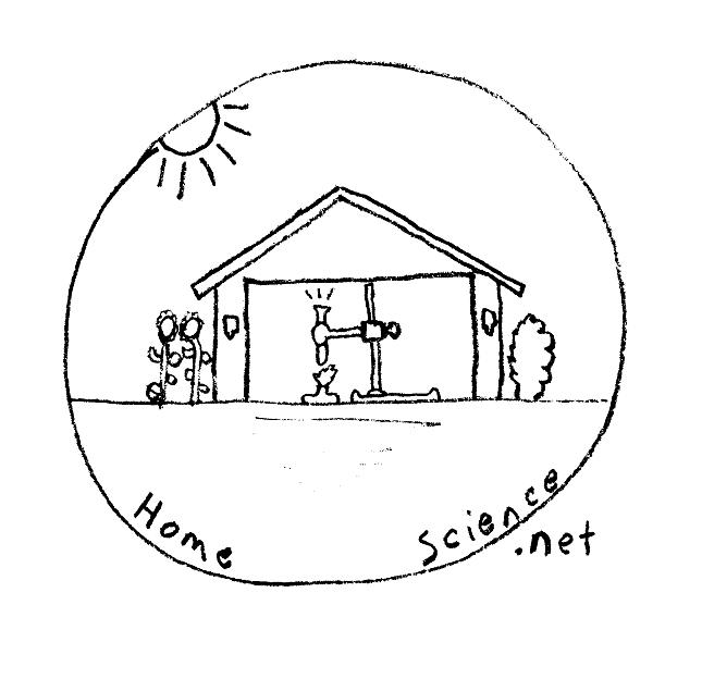
Here is my entry:

|
|
|
microcosmicus
Hazard to Others
  
Posts: 287
Registered: 31-12-2007
Member Is Offline
Mood: spin up
|
|
Labware, Bohr atoms, and structural formulas all suggest "chemistry"
and would be good to use. Your suggestion looks good to me.. I
suppose you could add a reflux condenser on top of that test tube, but
I think it is better not to because that would make the picture too
complicated which is not too good for something which is going
to be reproduced in miniature on letterheads and the like. For the
same reason, you might want to lose the flowers and the trees. They
also do not add much to the message which the house does not already
convey but instead distract my eye away from the experiment.
Also, since this logo is chemistry-oriented it might be better to
inscribe "Home Chemistry Society" under it. While
homescience.net is a good web address for hosting this and
leaves open room for adding physics, astronomy, biology,
etc. in the future, it might be well to not bite off more than
we can chew and start with the chemistry, Then we can
later add other sciences as their own divisions under the
homescience.net umbrella later on.
|
|
|
woelen
Super Administrator
        
Posts: 8011
Registered: 20-8-2005
Location: Netherlands
Member Is Offline
Mood: interested
|
|
Building on the ideas behind CyrusGrey's logo I have the following idea:

When it is scaled down to 200x200 pixels, it looks as follows (e.g. for letter heads)

An even smaller version, suitable for website page headers:

I used a somewhat classical old-fashioned looking font, used in older magazines. This is because I associate many home chemisty things with the nice
old labs, made of wood and other classical-appearance items.
The tubing font for HCS is derived from the glass tube in the window-picture.
This logo should express an open attitude. We don't have to hide something, hence the window.
[Edited on 18-3-08 by woelen]
|
|
|
chemkid
Hazard to Others
  
Posts: 269
Registered: 5-4-2007
Location: Suburban Hell
Member Is Offline
Mood: polarized
|
|
I liked the logo woelen!
|
|
|
microcosmicus
Hazard to Others
  
Posts: 287
Registered: 31-12-2007
Member Is Offline
Mood: spin up
|
|
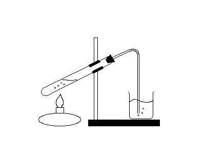
Personally, I would like a combination of the two --- Woelen's
house with the inscription, but with a picture in the window
more like that of Cyrus Gray's original drawing. The reason for
this is that I find the picture of a reaction going on more compelling
than pieces of glassware. It also suggests to me that home
chemistry is not about having chemicals and apparatus, but
about doing something, even if all you have is a homemade
alcohol burner, jelly jars, and household chemicals.
I think the open window motto is good and the tubing font
is clever.
To that end, I made this graphic for inclusion in the window of
the house which shows the gas being generated in the test tube
beig reacted with some liquid in a beaker.
[Edited on 18-3-2008 by microcosmicus]
[Edited on 18-3-2008 by microcosmicus]

|
|
|
microcosmicus
Hazard to Others
  
Posts: 287
Registered: 31-12-2007
Member Is Offline
Mood: spin up
|
|
Here is a lame attempt at sticking this image into the window of the house.
If people like this, it should be improved by making the lines clearer,
adding color, etc, but at least this should give an idea how the logo
might look with this image in the window.
[Edited on 18-3-2008 by microcosmicus]

|
|
|
woelen
Super Administrator
        
Posts: 8011
Registered: 20-8-2005
Location: Netherlands
Member Is Offline
Mood: interested
|
|
Microcosmicus, your change is great! No need to add color, but it would be great if you make a version of your picture with sharper and somewhat
thicker lines which fits in the window, such that a scaled down version still looks good.
I agree with you that the picture of a reaction going on is more appealing than a static picture with some glassware.
|
|
|
CyrusGrey
Hazard to Others
  
Posts: 123
Registered: 20-1-2007
Location: USA
Member Is Offline
Mood: Oooh! Shiny!
|
|
Well, when I look at Woelen's logo, my eye is first drawn to the large text, then to the glassware.
When I look at Microcosmicus' logo, my eye is first drawn to the test tube, then to the burner, then to the beaker, and then to the large text.
Perhaps something slightly simpler or more compact that still has action going on?
[Edited on 19-3-2008 by CyrusGrey]
|
|
|
chromium
Hazard to Others
  
Posts: 284
Registered: 27-6-2005
Member Is Offline
Mood: reactive
|
|
Maybe something like this?

When all think alike, then no one is thinking. - Walter Lippmann
|
|
|
MagicJigPipe
International Hazard
    
Posts: 1554
Registered: 19-9-2007
Location: USA
Member Is Offline
Mood: Suspicious
|
|
I like that general idea chromium. It's simple and indicative. Nice work.
The flower seems a little out of place, though.
I also like how the house's chimney seems to be replaced with the neck of the flask. Very creative.
[Edited on 22-3-2008 by MagicJigPipe]
"There must be no barriers to freedom of inquiry ... There is no place for dogma in science. The scientist is free, and must be free to ask any
question, to doubt any assertion, to seek for any evidence, to correct any errors. ... We know that the only way to avoid error is to detect it and
that the only way to detect it is to be free to inquire. And we know that as long as men are free to ask what they must, free to say what they think,
free to think what they will, freedom can never be lost, and science can never regress." -J. Robert Oppenheimer
|
|
|
CyrusGrey
Hazard to Others
  
Posts: 123
Registered: 20-1-2007
Location: USA
Member Is Offline
Mood: Oooh! Shiny!
|
|
Very nice Chromium! Simple, to the point. I like the flower too though!
It seems the best candidate so far to me. 
|
|
|
microcosmicus
Hazard to Others
  
Posts: 287
Registered: 31-12-2007
Member Is Offline
Mood: spin up
|
|
You could make the flower look like a Bohr atom.
The placement of the glass bulb reminds me of a
birdhouse  Alternatively, it looks like Alternatively, it looks like
cyclopentanone with the oxygen and
the double bond forming the flask.
Should this be adopted as logo, we will
need to do the synthesis of cyclopentanone
as one of the experiments.
|
|
|
woelen
Super Administrator
        
Posts: 8011
Registered: 20-8-2005
Location: Netherlands
Member Is Offline
Mood: interested
|
|
I also like this one very much, including the flower. This is a very creative logo, especially the chimney as being the neck of the flask. To me, the
flower is quite essential. It makes the logo look more friendly and it also associates home chemistry with innocence. So, as far I am concerned, leave
the flower and don't change it to an atom model.
Another important thing is that this logo also nicely scales down to 150x150 pixels.
[Edited on 23-3-08 by woelen]
|
|
|
chromium
Hazard to Others
  
Posts: 284
Registered: 27-6-2005
Member Is Offline
Mood: reactive
|
|
Thanks for all of your sugestions! This logo is not actually much more than just compilation of ideas which were exposed earlier in this thread.
Today i did some final touching on logo design. Now it looks a bit more finished.

When all think alike, then no one is thinking. - Walter Lippmann
|
|
|
woelen
Super Administrator
        
Posts: 8011
Registered: 20-8-2005
Location: Netherlands
Member Is Offline
Mood: interested
|
|
Shall we choose from the logo's, presented here now? I think we now have seen sufficient ideas and we should be capable of choosing one.
I vote for the last one, it looks very cute and we can use it as such in the webpages as it is now.
|
|
|
CyrusGrey
Hazard to Others
  
Posts: 123
Registered: 20-1-2007
Location: USA
Member Is Offline
Mood: Oooh! Shiny!
|
|
Aye, I vote for the last one as well.
|
|
|
microcosmicus
Hazard to Others
  
Posts: 287
Registered: 31-12-2007
Member Is Offline
Mood: spin up
|
|
I started a poll for this --- please cast your votes there,
Maybe in a week or so, if we get enough votes, we
can declare the winning logo official and move
on from there.
|
|
|
Neil
National Hazard
   
Posts: 556
Registered: 19-3-2008
Member Is Offline
Mood: No Mood
|
|
I like chromium's; it's hard to be synical about it or see 'bomb' or 'drug' creation.
|
|
|
dennisfrancisblewettiii
Hazard to Self
 
Posts: 61
Registered: 16-12-2005
Location: Madison, Wisconsin
Member Is Offline
|
|
I don't know. A flower implies drugs. And the stem of the flask implies bomb.
|
|
|
The_Davster
A pnictogen
      
Posts: 2861
Registered: 18-11-2003
Member Is Offline
Mood: .
|
|
Care to explain those strange generalizations?
|
|
|
MagicJigPipe
International Hazard
    
Posts: 1554
Registered: 19-9-2007
Location: USA
Member Is Offline
Mood: Suspicious
|
|
A lot of plants have flowers, not just he ones that produce drugs.
So, that's why florence flasks look like that! To brainwash us into thinking "bomb" whenever we see or use one!
I get it now! (sarcasm)
"There must be no barriers to freedom of inquiry ... There is no place for dogma in science. The scientist is free, and must be free to ask any
question, to doubt any assertion, to seek for any evidence, to correct any errors. ... We know that the only way to avoid error is to detect it and
that the only way to detect it is to be free to inquire. And we know that as long as men are free to ask what they must, free to say what they think,
free to think what they will, freedom can never be lost, and science can never regress." -J. Robert Oppenheimer
|
|
|